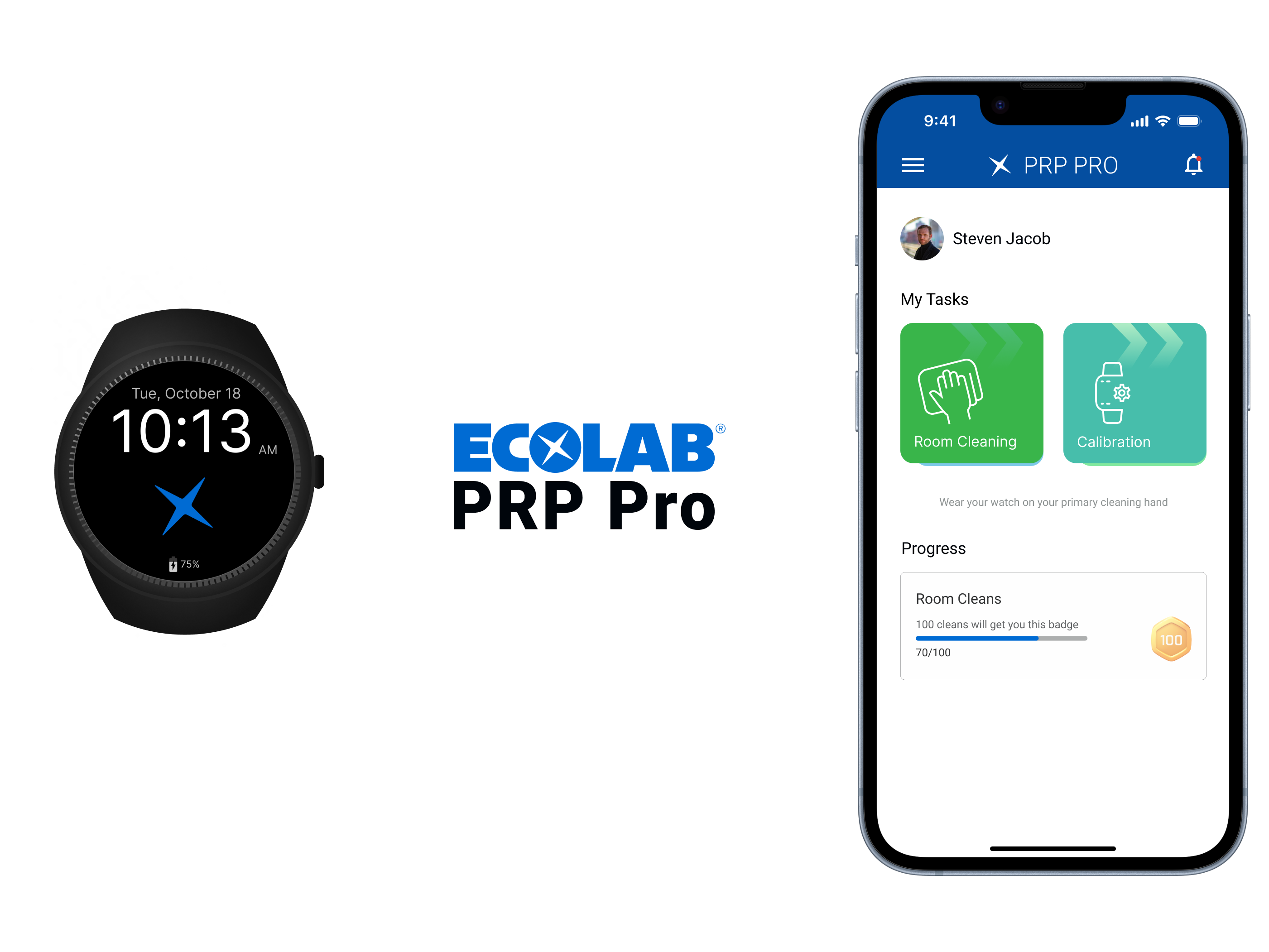
Financial Impact, as the name suggest, is a dashboard that helps us measure the financial impact that is being made on industrial plants by looking at areas where savings can happen. Some of these areas include water, energy, waste etc. By using less water, less energy and by creating less waste, they can save on financials. The dashboard displays these numbers.
MADE IMPROVEMENTS ON THE EXISTING DASHBOARD
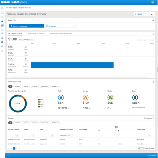
BEFORE
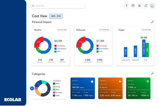
AFTER
When the Financial Impact project was brought to us, we realized that the problem that the dashboard was trying to cater to, as well as the solution to it were unknown. Due to this, we needed to take a Design Thinking approach, wherein we first had to try and identify the problem at hand. We started with analysing the existing Financial Impact (FI) dashboard
GOALS OF UX RESEARCH
1. Refreshing the current Financial Impact Dashboard with additional functionality and UX to increase adoption with Customer Account Managers, Customers and Field Sales reps.
2. Replace other methods to track TVD (i.e., excel sheets) used by corporate account managers right now to keep tabs on the sites that they oversee.
3. Understand the core need amongst corporate account managers and their customers, from a functionality standpoint
4. Exploring how this dashboard can serve as a facilitation tool to help account managers to get the customers onboard with the necessary solutions.
WHO?
The Financial Impact dashboard will be used by higher management members on the customers' end and by Customer Account Managers on Ecolab’s end. The Customer Account Managers are in direct contact with the higher management on the customer’s end.
User interviews were conducted among Customer Account Managers (CAMs) within ECOLAB. They were able to provide useful insights with respect to what they need to carry out their functions daily. We conducted several user interview rounds with Customer Account Managers across ECOLAB and understood the primary functions that need to be brought up front.
WHERE?
All interviews were conducted online since the stakeholders were from all around the globe and in different timezones. We used MIRO to collaboratively identify problems and come up with solutions.
HOW?
The users were first walked through the existing dashboard and then they were asked to list out what works well for them as well as what does not work well for them right now. They were asked to list out things that they feel would help them carry out the job more efficiently and any other ideas that they might have.
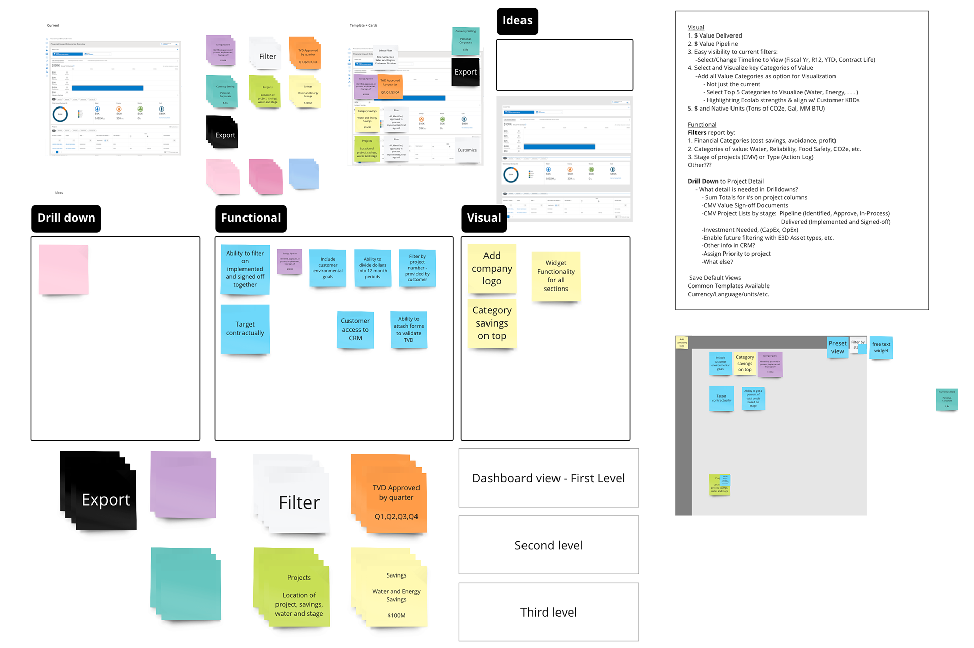
Ideas that the users came up with were put into one of the 3 categories-
1. Visual
2. Functionality
3. Drill down.
Following that, the same ideas were categorised into 3 sections-
1. Dashboard level view - Information that we would want right up front on the homepage of the dashboard, and any kind of filter that we might be able to apply.
3. Second level view - Any kind of details that has been drilled down to
3. Third level view - any kind of drill down beyond the second level view
RECOGNISED THE PRIMARY PROBLEMS
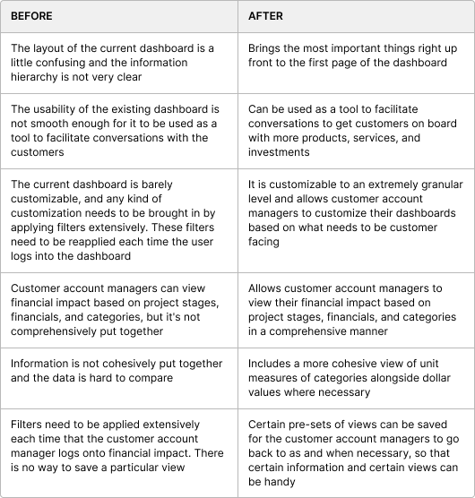
1. The current dashboard is barely customizable, and any kind of customization needs to be brought in by applying filters extensively. These filters need to be reapplied each time the user logs into the dashboard.
2. Information is not cohesively put together and the data is hard to compare.The layout of the current dashboard is a little confusing and the information hierarchy is not very clear.
3. Customer account managers can view financial impact based on project stages, financials, and categories, but it's not comprehensively put together.
4. Filters need to be applied extensively each time that the customer account manager logs onto financial impact. There is no way to save a particular view.
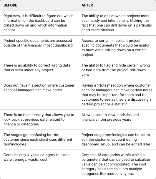
5. Right now, it is difficult to figure out which information on the dashboard can be drilled down on and which information cannot.
6. The stages get confusing for the customer since each client uses different terminologies.
7. Contains only 4 value category buckets - water, energy, waste, cost